×


Contact Me
This project's dataset is the "Historical Hourly Weather Data", which was collected from Kaggle. Encompassing a rich compilation of meteorological information across various cities, the dataset consists of multiple CSV files, each representing a crucial facet of weather data. Here's a concise overview of the primary datasets:
This rich dataset enables in-depth investigation and analysis, allowing the project to discover trends, anomalies, and insights into the dynamic nature of meteorological conditions. Furthermore, the project uses data from the OpenWeatherAPI to supplement the Kaggle dataset with real-time weather information, enabling for complete exploration of numerous weather occurrences and the development of effective machine learning models for weather prediction and insights.
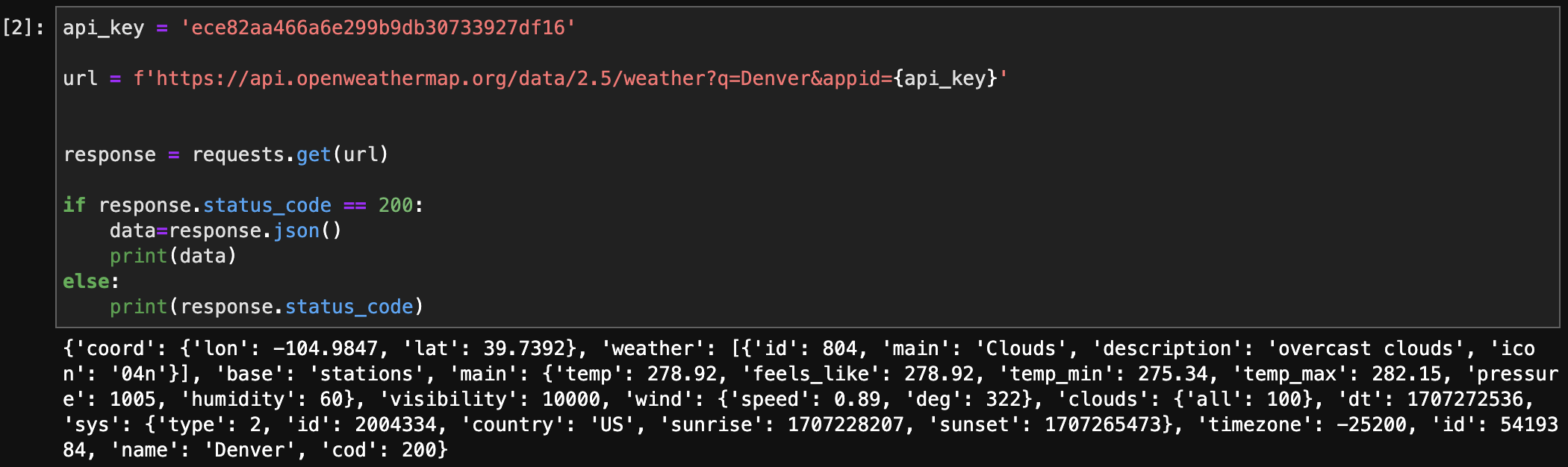
API: OpenWeatherMapAPI
Endpoint: https://api.openweathermap.org/data/2.5/weather
API Call Example: https://api.openweathermap.org/data/2.5/weather?q=Denver&appid={API key}
Historical Hourly Weather Data (csv): Kaggle Data
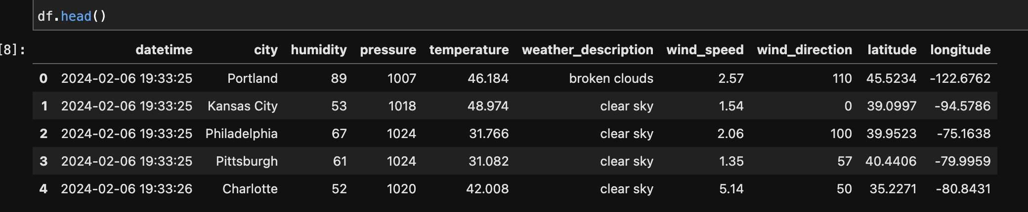
The step involved iterating through each city, creating a unique API request URL with the city name and API key, then issuing a GET request to retrieve the weather data. After a successful request (status code 200), relevant information such as humidity, pressure, temperature, weather description, wind speed, wind direction, latitude, and longitude was extracted from the JSON response. The obtained data was then organised into a DataFrame, which represented the weather conditions in the specified cities.
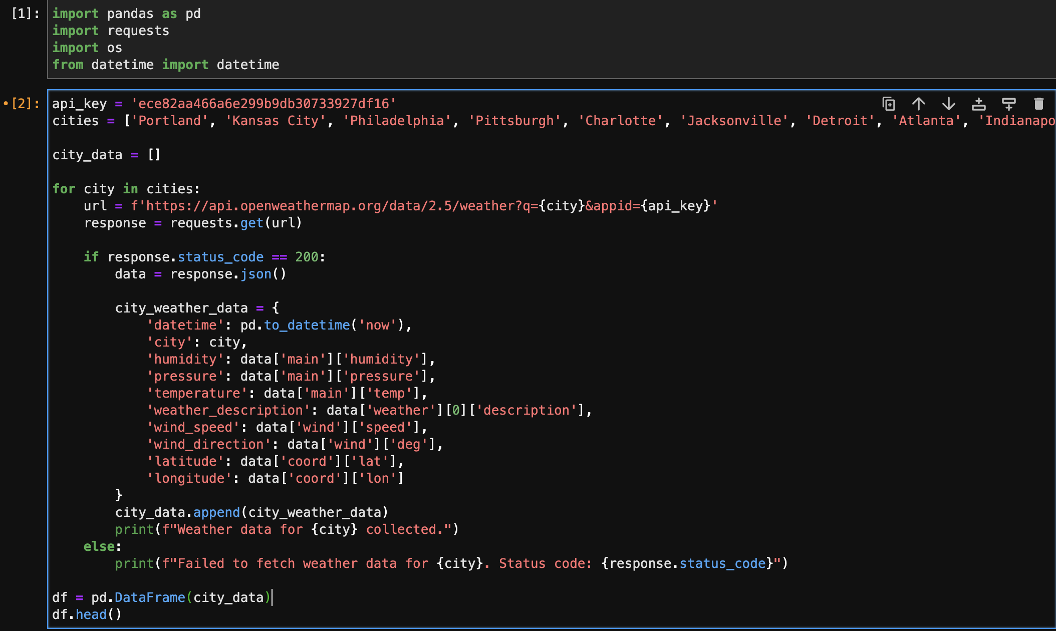
This technique is used to access certain fields or elements within the JSON structure to acquire the relevant data points such as humidity, pressure, temperature, weather description, wind speed, wind direction, and geographic coordinates.
After Parsing: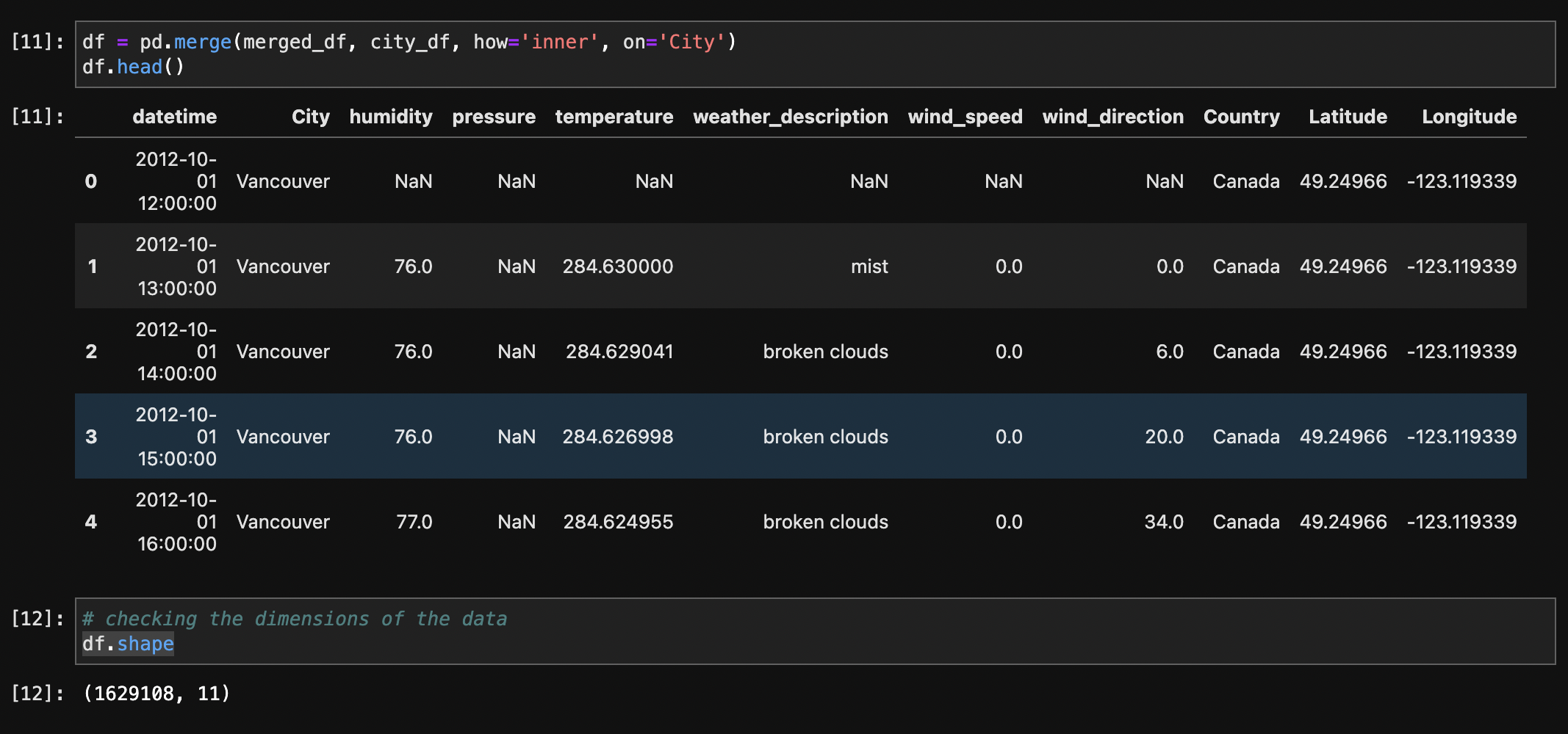
This step converts the 'datetime' column in the DataFrame to the format 'YYYY-MM-DD HH:MM:SS', improving readability and compatibility with other data processing tasks.
After converting datetime to required format: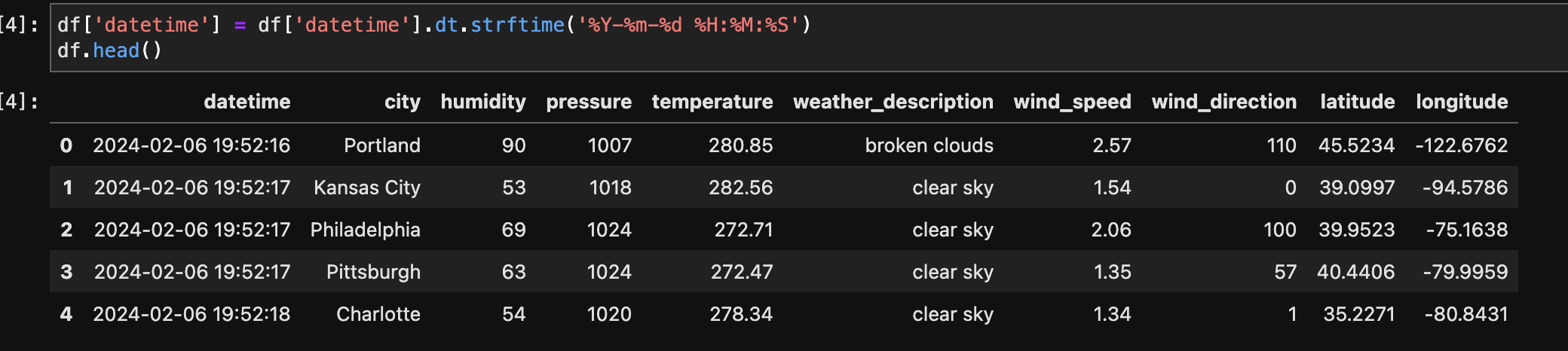
The temperature column, initially in Kelvin, was converted to Fahrenheit for better interpretability.
After Temperature conversion :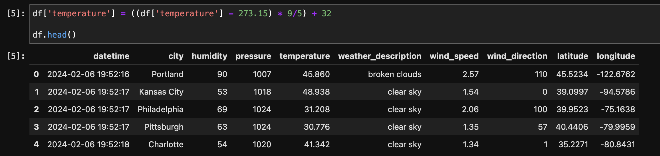
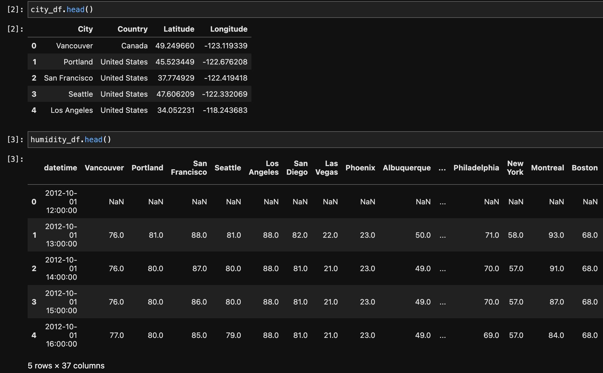
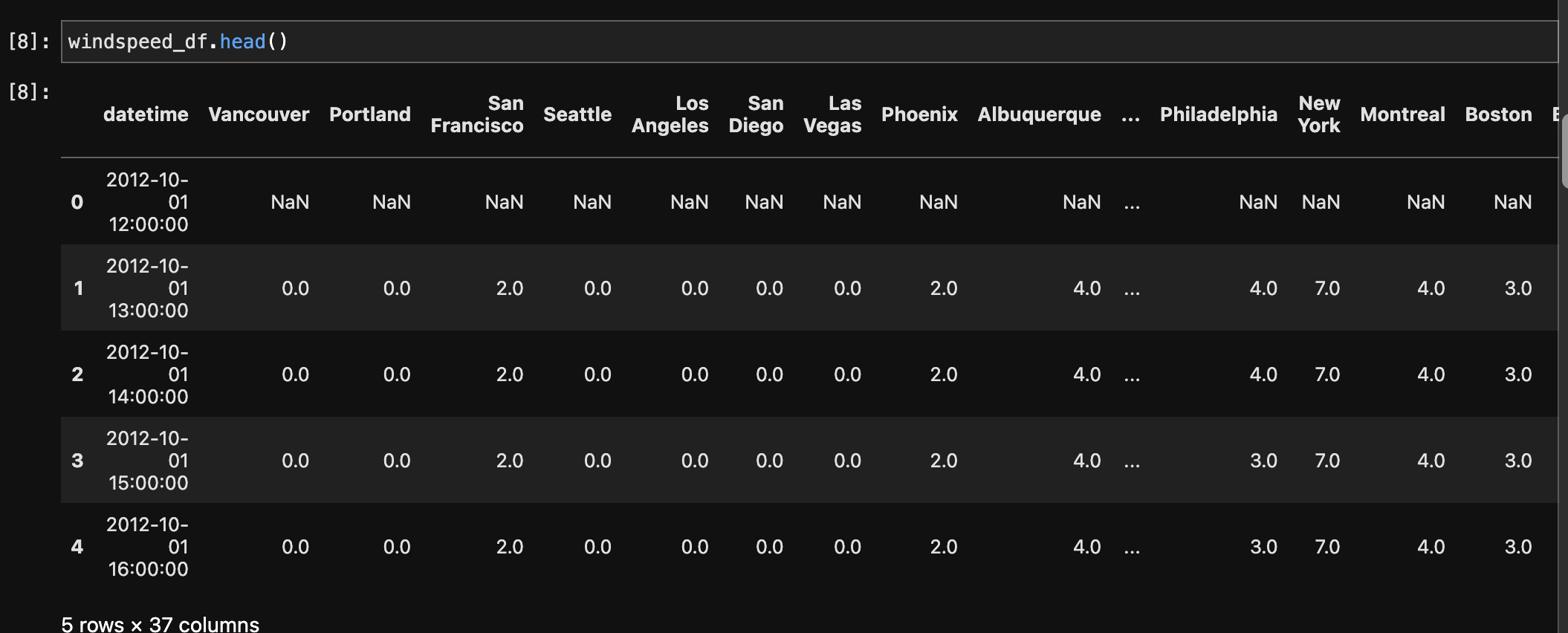
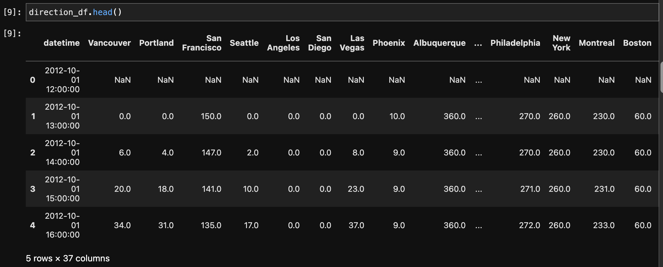
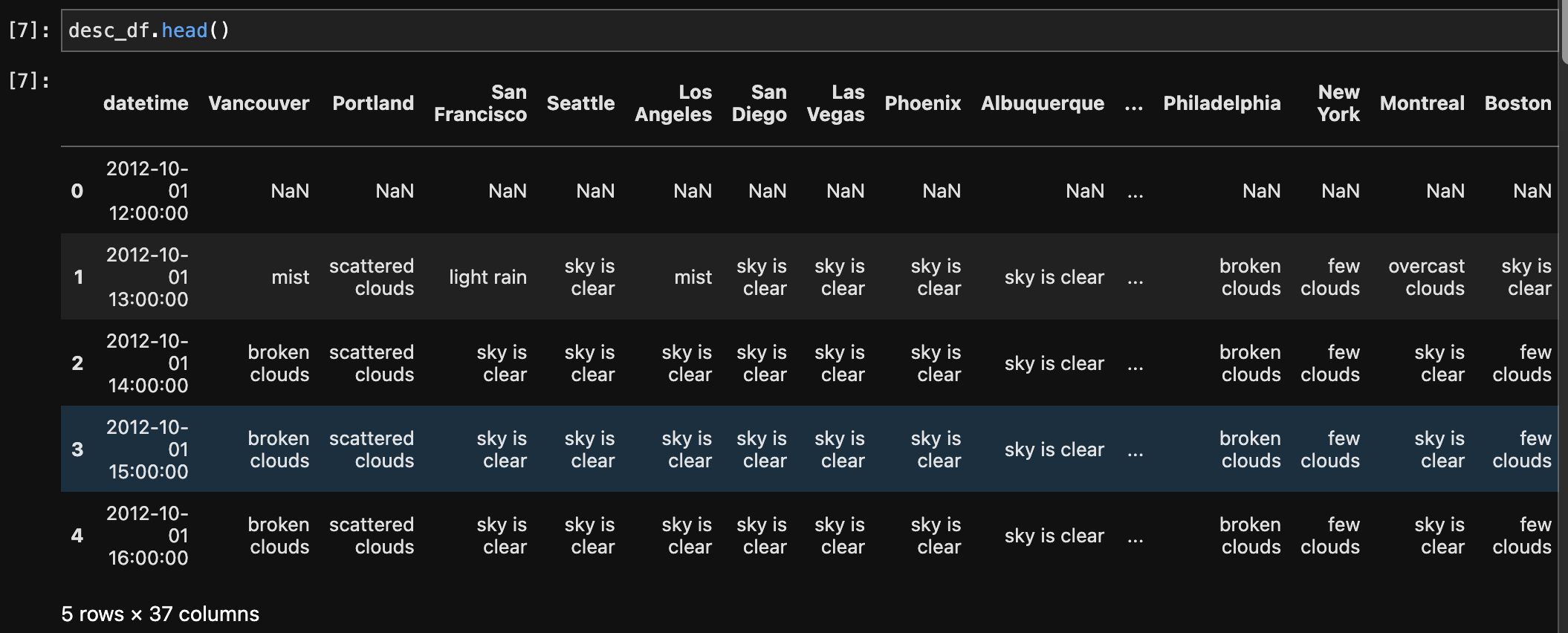
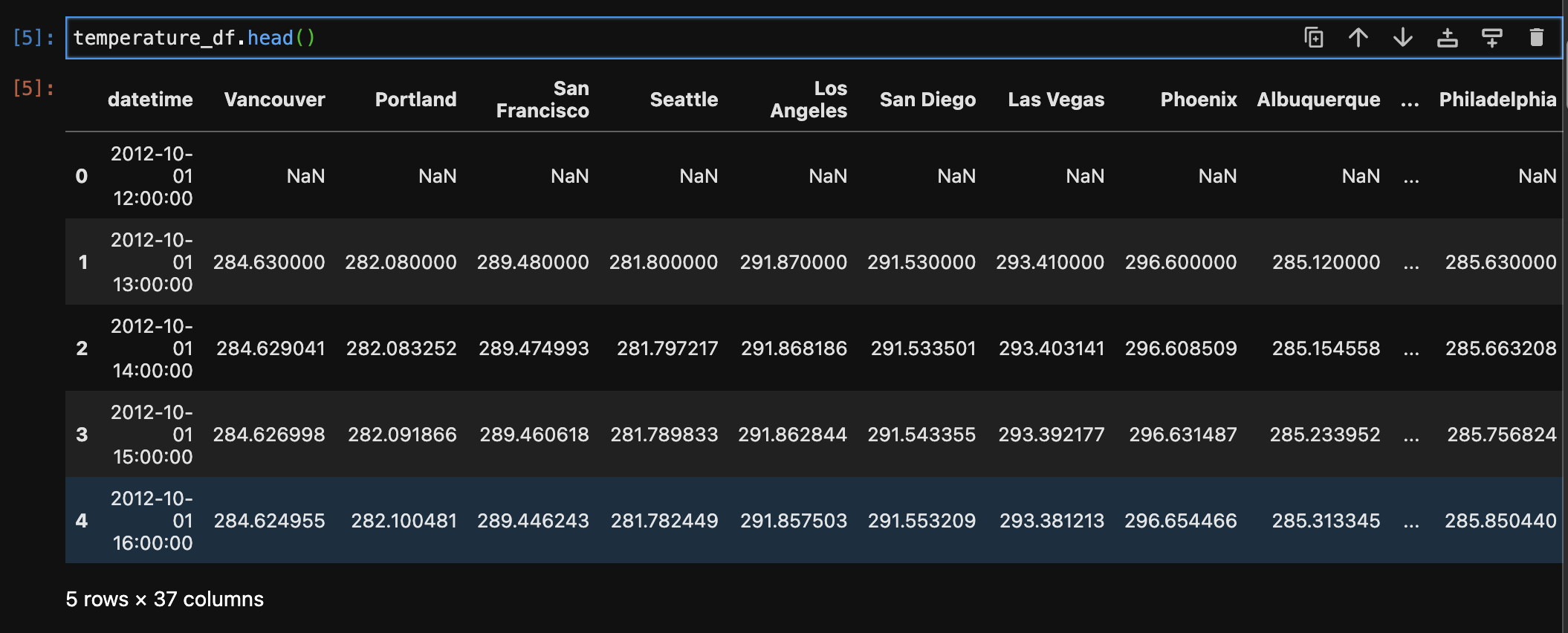
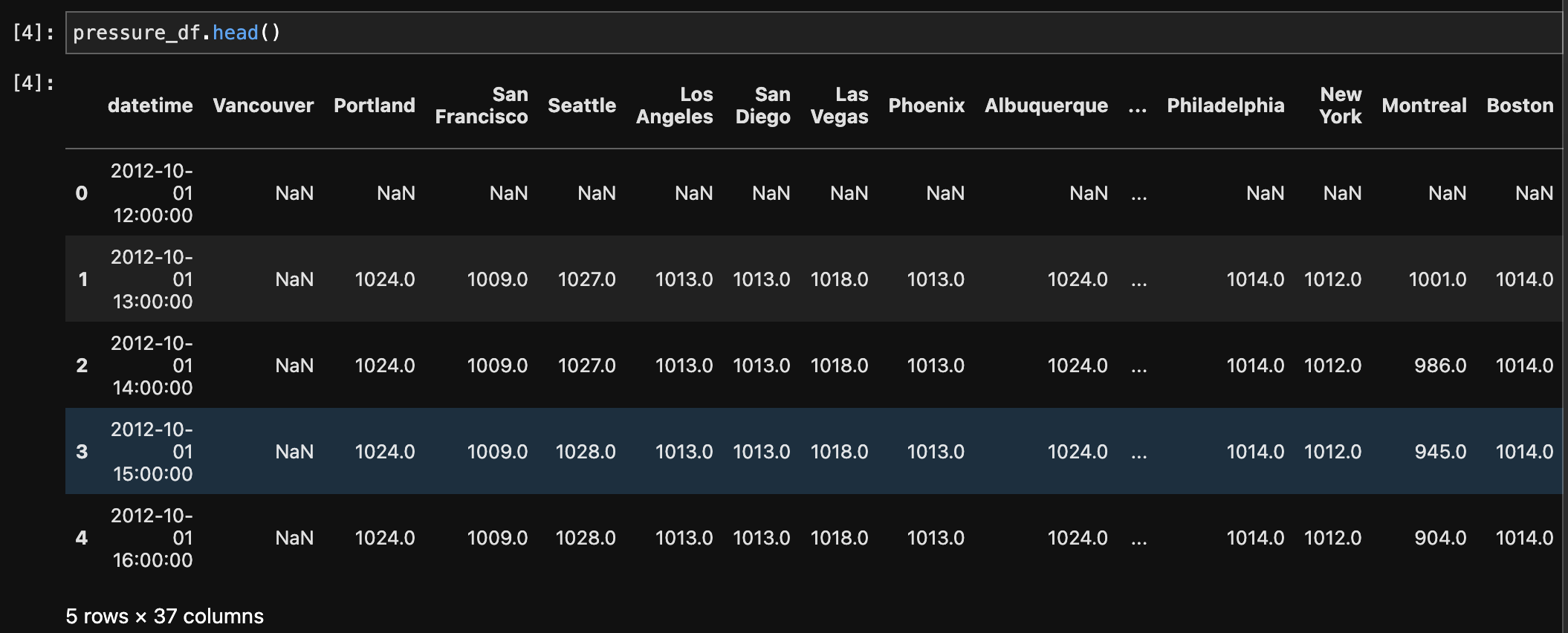
Multiple datasets comprising weather-related information, such as humidity, pressure, temperature, weather description, wind speed, and wind direction, were first melted and then combined to make a single dataset. The melting technique converted the original wide-format data to a long-format, making it easier to merge based on shared columns. The records were then integrated based on the 'datetime' and 'City' columns, yielding a comprehensive dataset with consolidated meteorological information for numerous cities. Furthermore, a merge with a city dataset based on the 'City' column was undertaken to enhance the weather dataset with additional information such as each city's country, latitude, and longitude. This final combined dataset provides a comprehensive perspective of weather conditions in different cities and geographical areas.
After Merging:
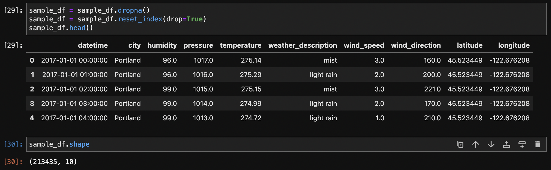
The dataset initially had 1,629,108 rows and 11 columns. To aid analysis and management of the vast dataset, a sample centred on 2017 and particular to the United States was created, resulting in a significantly smaller set of 215,811 rows. The 'datetime' column was converted to datetime format, and the 'Country' column, which contained a consistent value for the United States, was later removed because it was no longer useful. This sampling and cleaning process enabled more efficient handling of the data for subsequent analysis, specifically targeting weather conditions in the United States during the year 2017.
After Sampling and dropping Country column: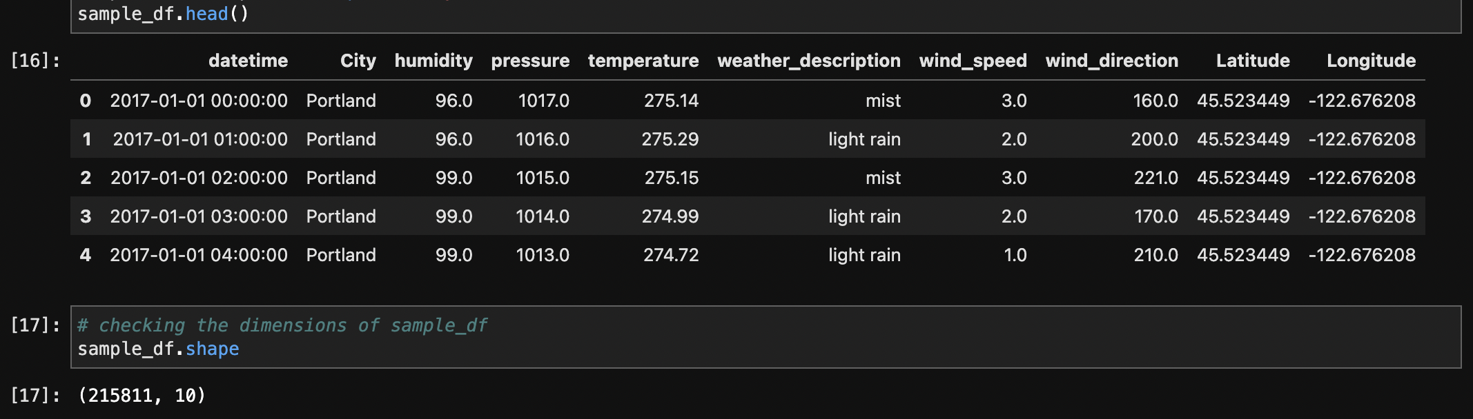
To ensure consistency in column names, the column names of the dataset were reviewed and subsequently converted to lowercase. This step aids in standardizing the naming conventions, promoting clarity and simplicity throughout the analysis process.
After renaming the Columns: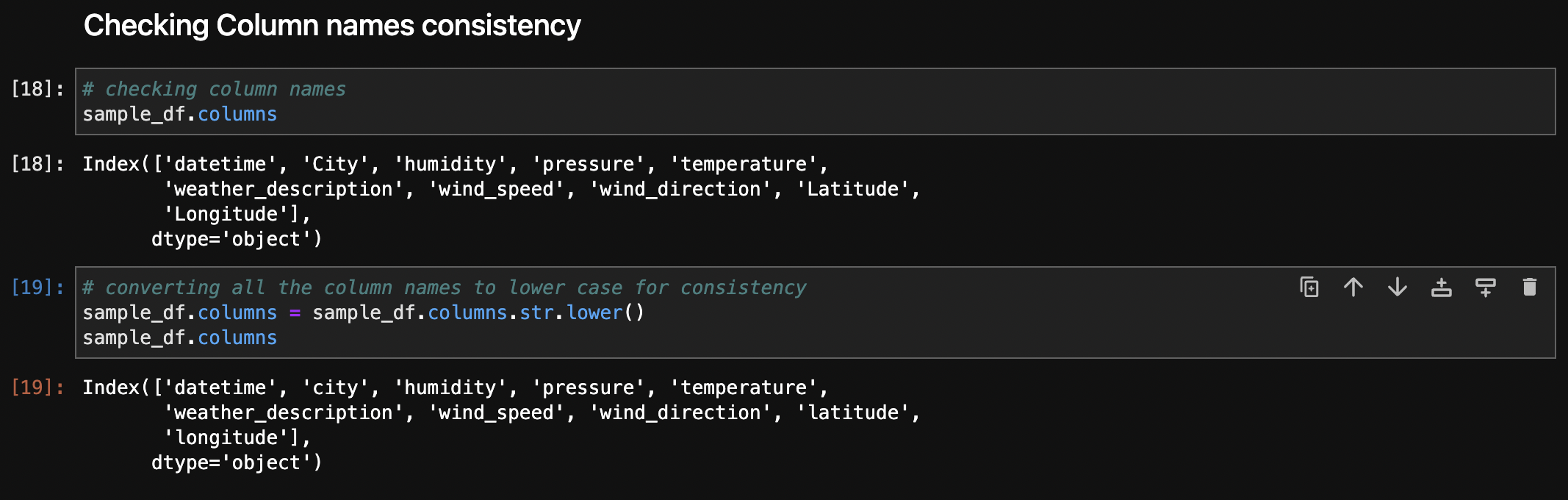
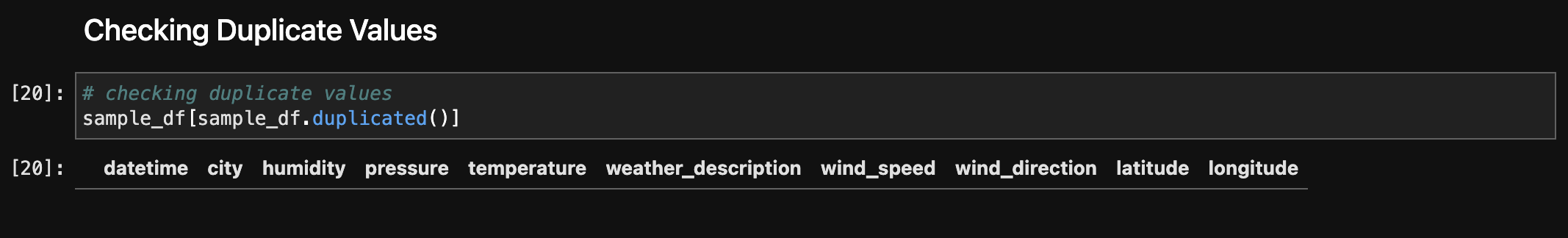
Checking duplicated rows to ensure data integrity and there were no duplicate records. The absence of duplicate rows in the dataset suggests that each entry is unique, contributing to the data's reliability and reducing redundancy.
The temperature column, initially in Kelvin, was converted to Fahrenheit for better interpretability.
After temperature conversion :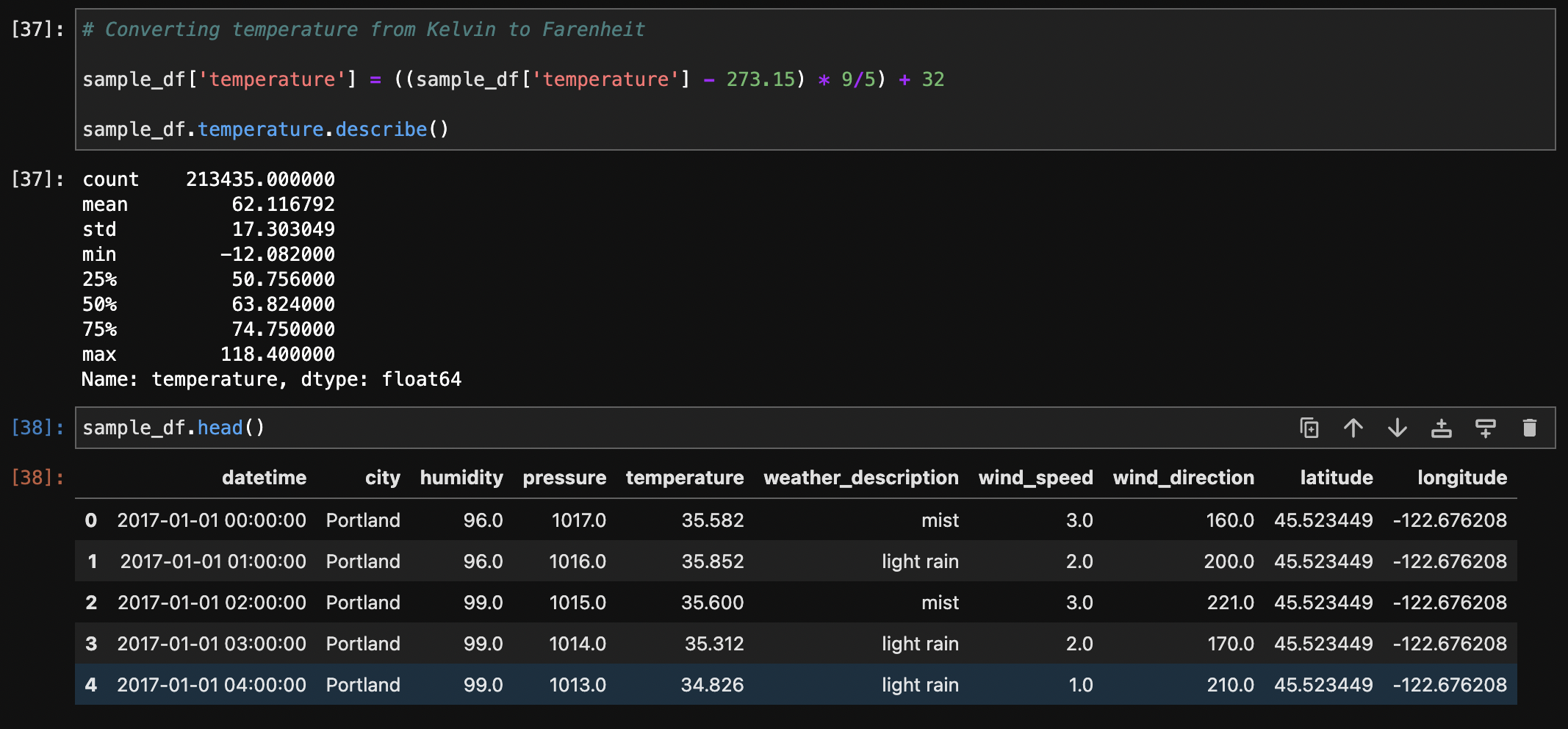
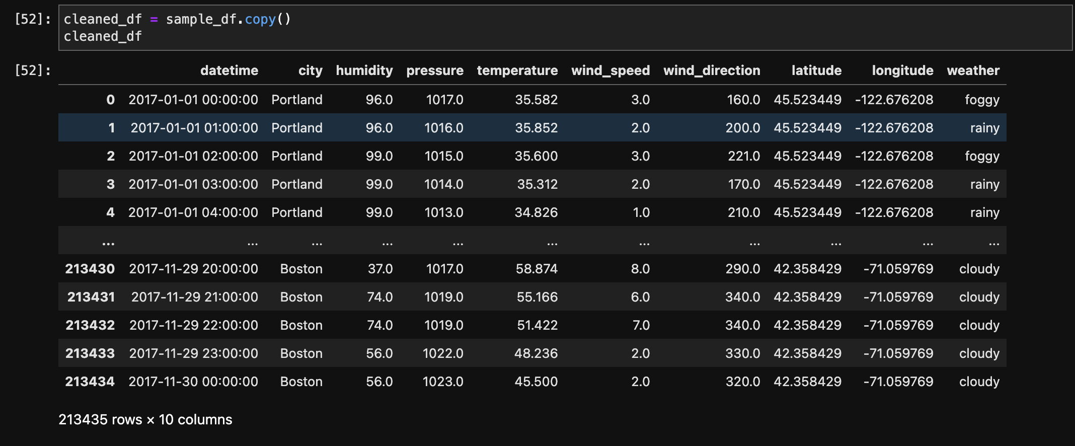
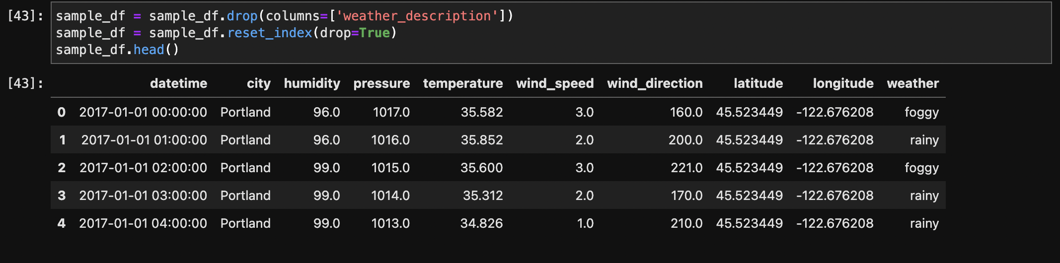
The weather description column was analyzed, and a new categorical column named 'weather' was created based on the types of weather conditions. The function weather_labels was defined to categorize weather descriptions into labels such as 'clear,' 'rainy,' 'snowy,' 'thunderstorm,' 'foggy,' 'cloudy,' and 'other.' The original weather description column was converted to lowercase to ensure consistency, and the new 'weather' column was added to the dataset. The resulting dataset, now with the 'weather' column, provides a more simplified and informative representation of weather conditions for further analysis, with 213,435 rows and 11 columns.
Label Function :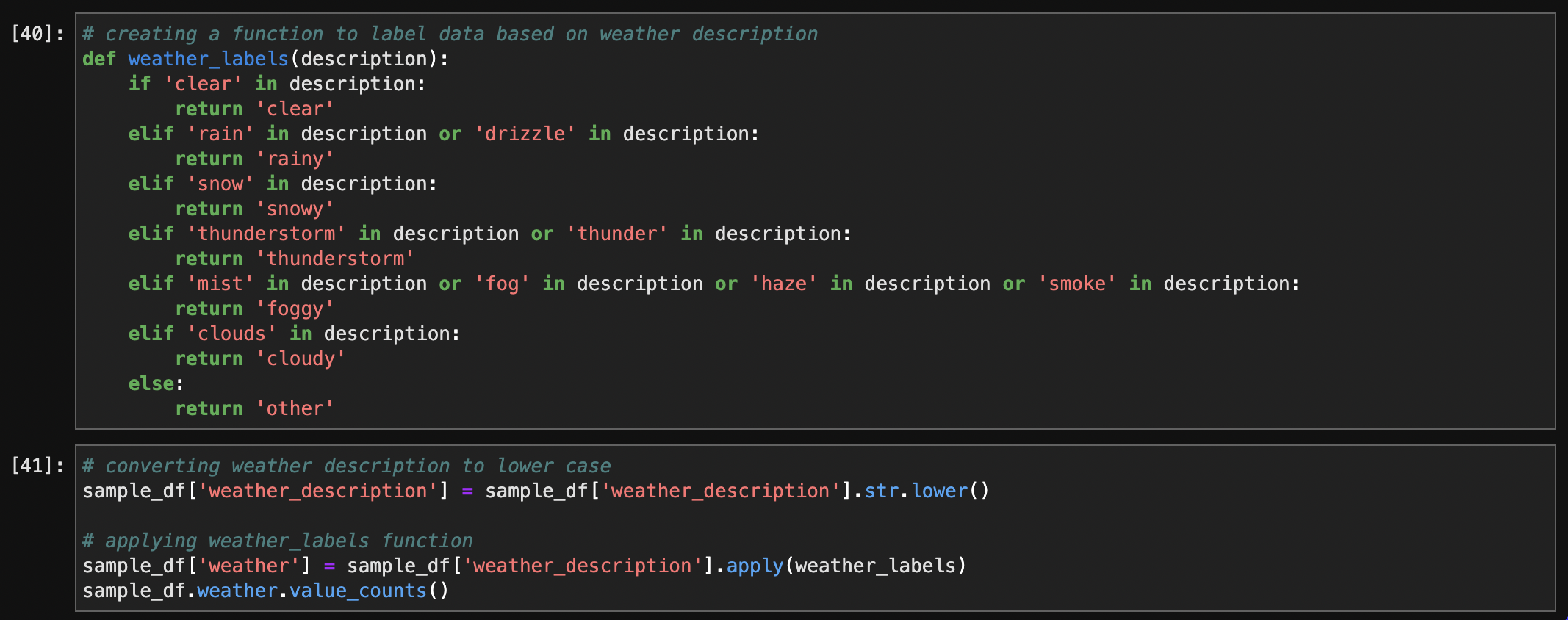
The data types of the columns in the dataset were initially inspected, revealing datetime and numerical types. Converted the qualitative, nominal, and categorical data (weather) to the 'Category' type.
After Checking Data Types: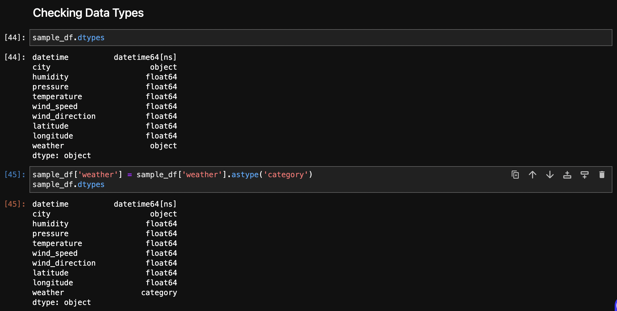
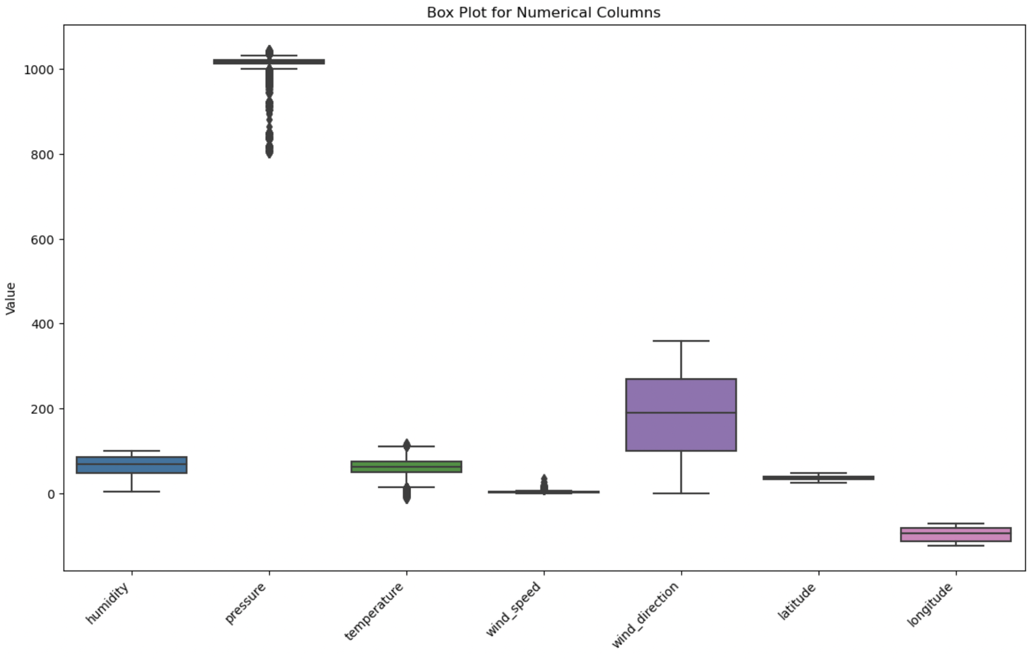
The box plot provides a graphical representation of the distribution of values, highlighting potential outliers based on their deviation from the interquartile range. Outliers were identified in pressure, temperature and wind_speed. However, after further inspection using values_count() method, it was determined that they are due to natural variation in the data, also known as true outliers. True outliers should be left as they are in the dataset.
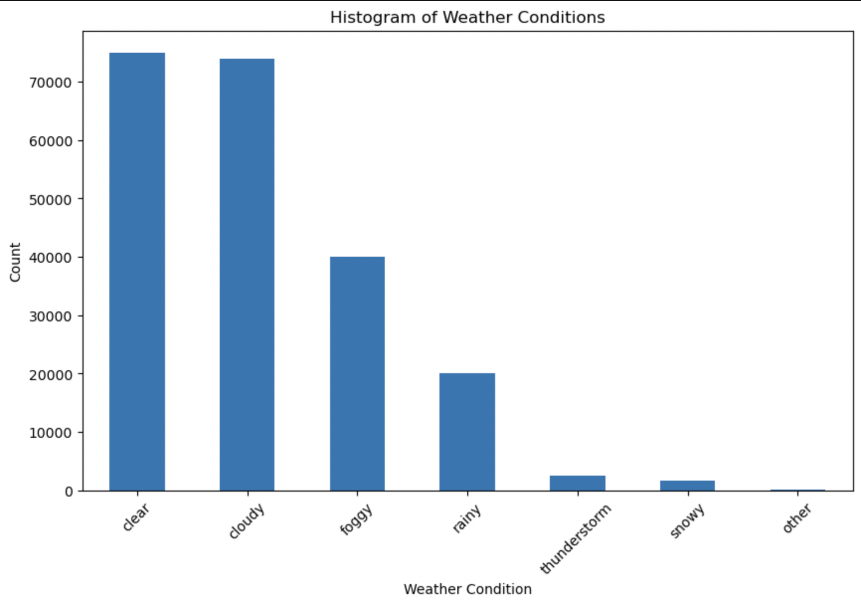
From the above Histogram, it is evident that for most of the days the weather is clear or cloudy across the cities in 2017.
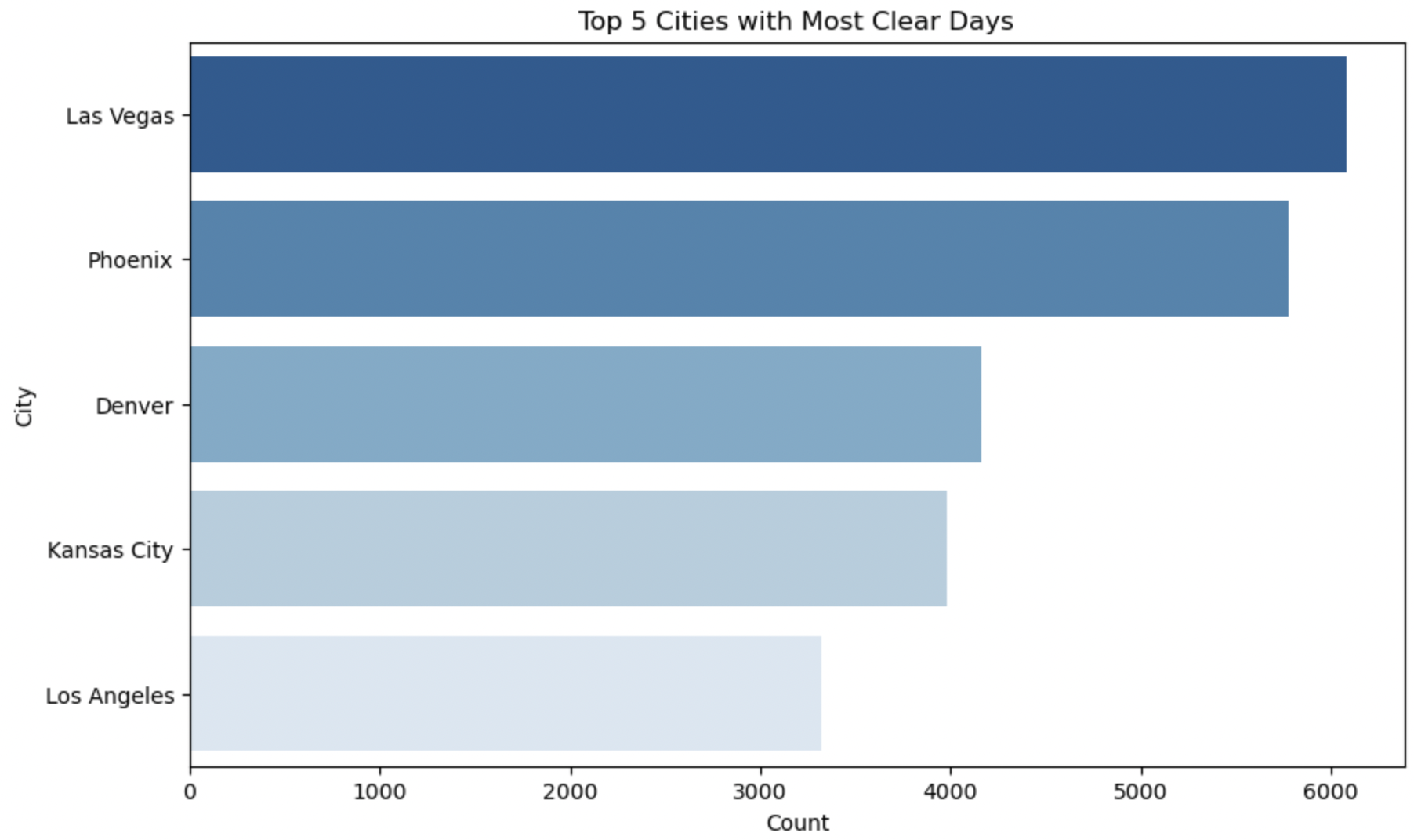
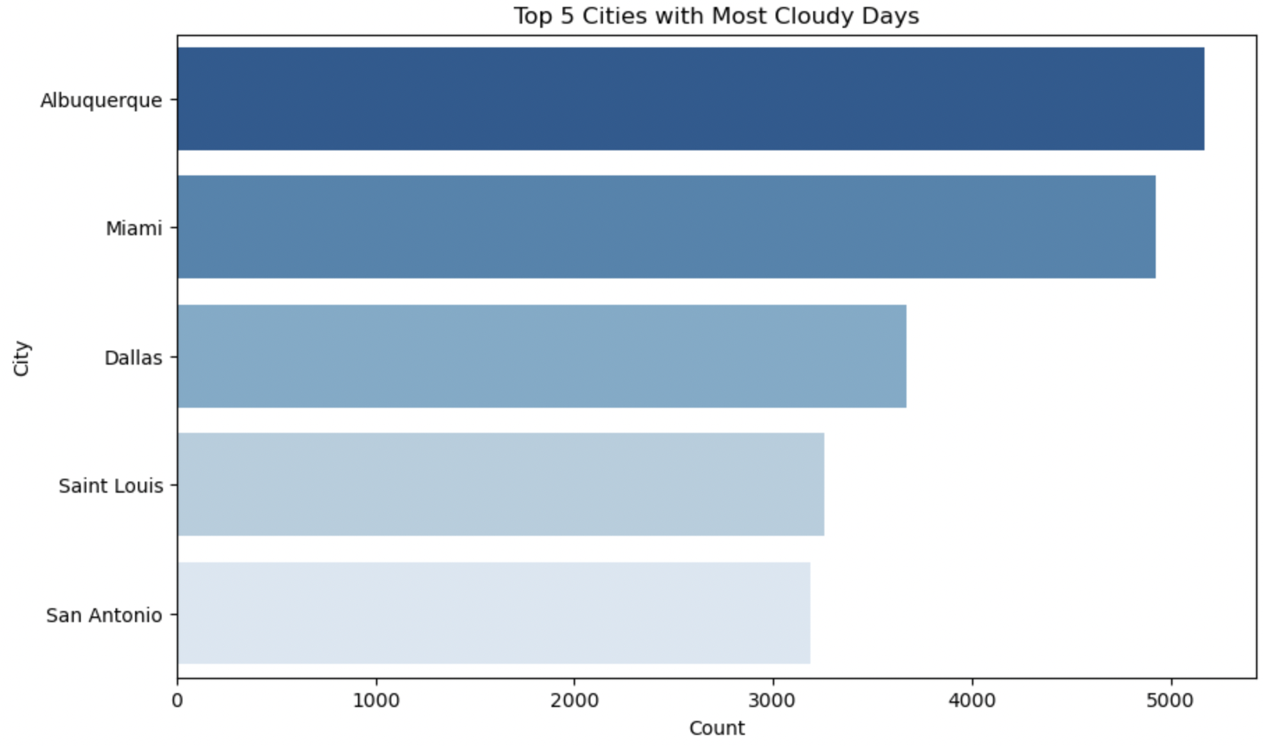
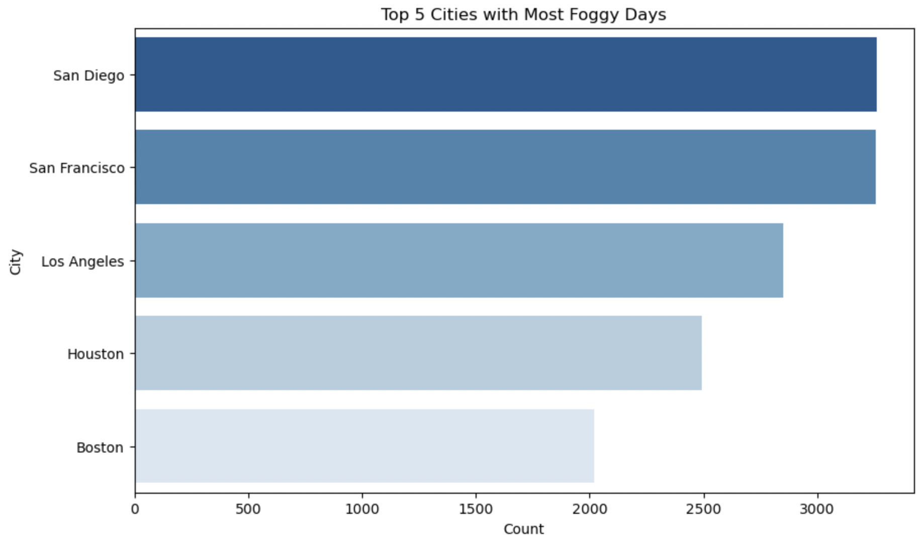
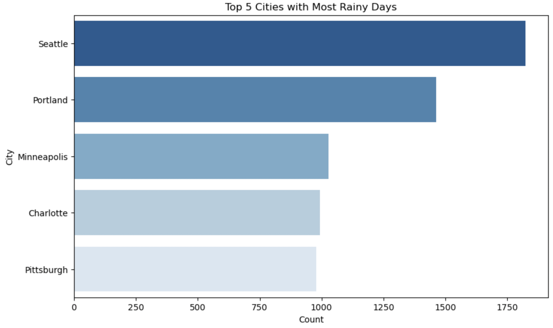
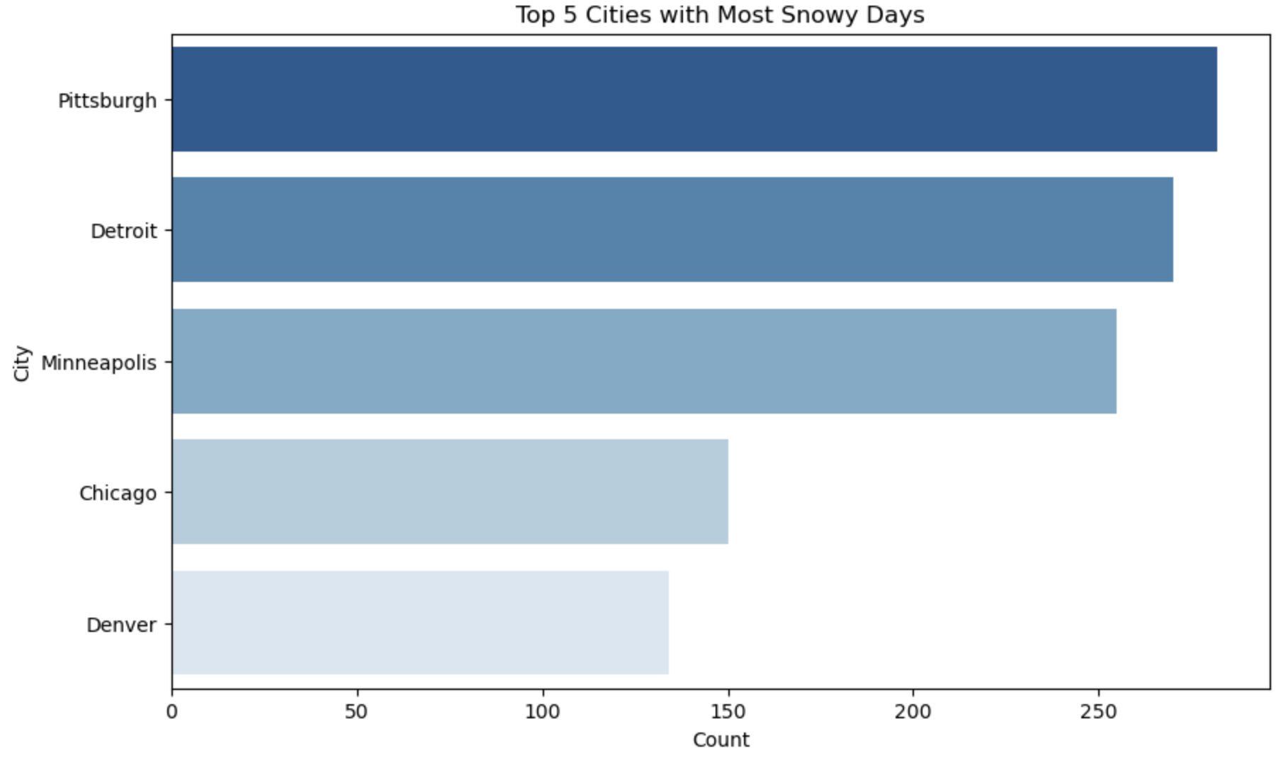
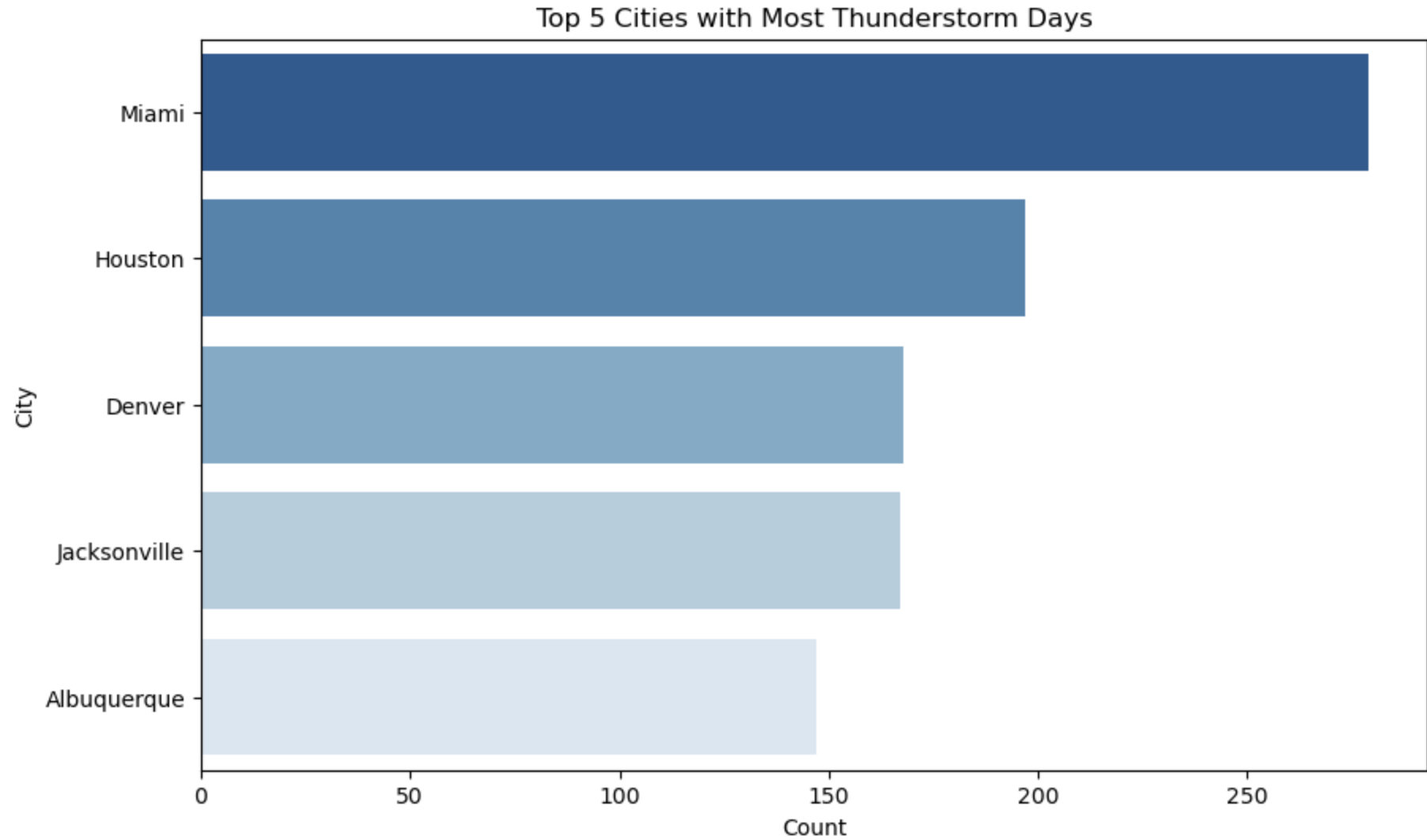
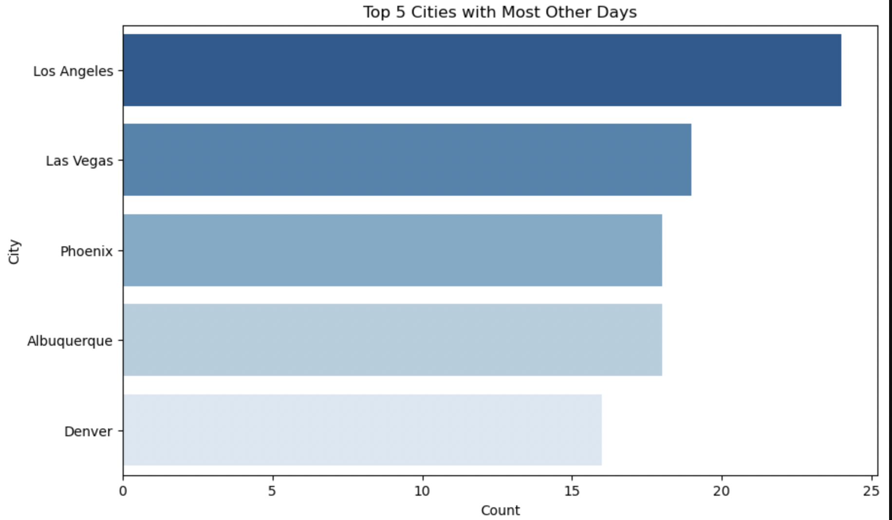
The above Horizontal Bar Plots interprets Top 5 cities having most days of particular weather condition.
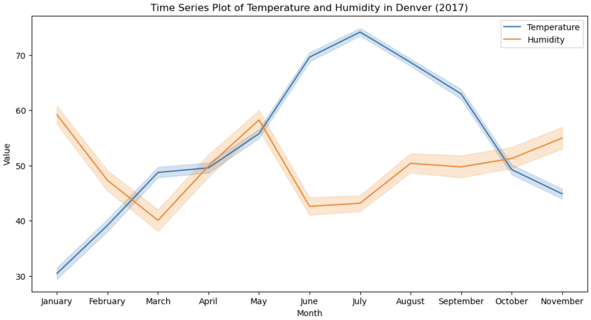
The above Time Series Line plot provides below information:
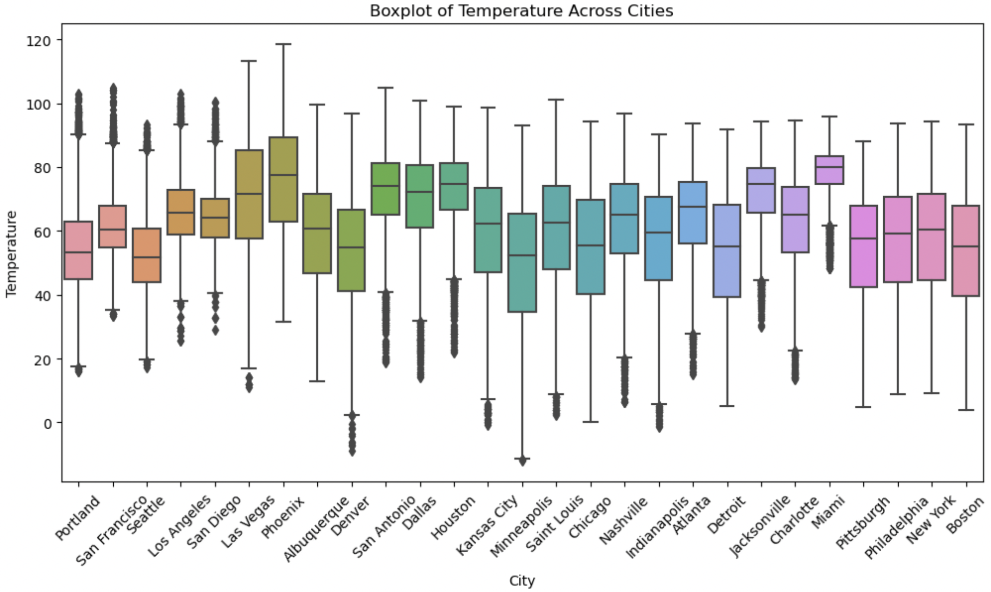
The above Box Plot shows the distribution of Temperature across the cities.
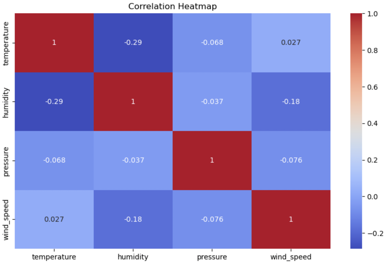
The above Correlation Heatmap depicts the correlations coefficient between the numerical variables like temperature, humidity, pressure and wind_speed.
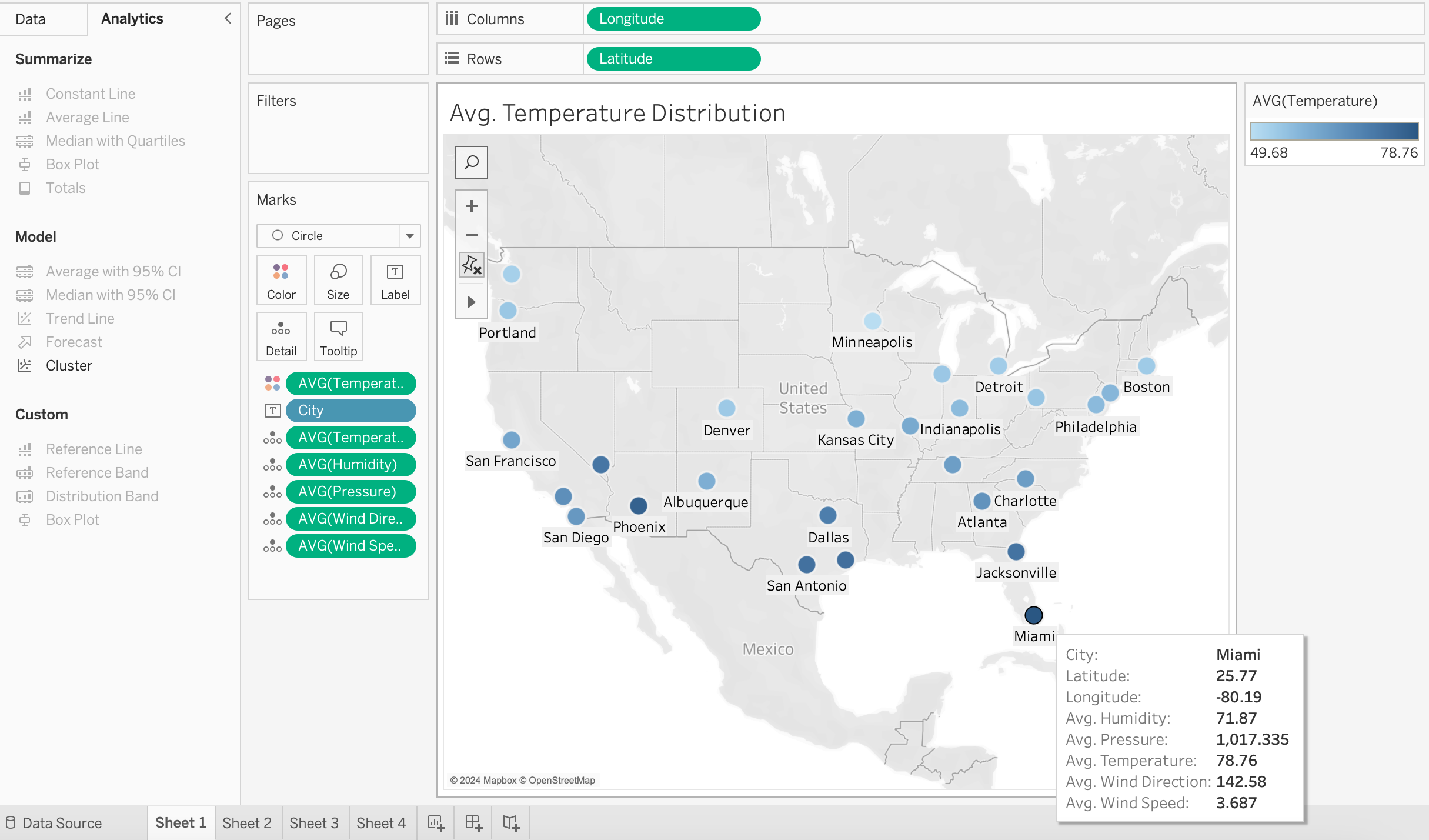
The above Map in Tableau depicts the Average Temperature distribution across the cities in 2017. City with highest average temperature is in Dark Blue color whereas the City with lowest average temperature color is in Light Blue color.
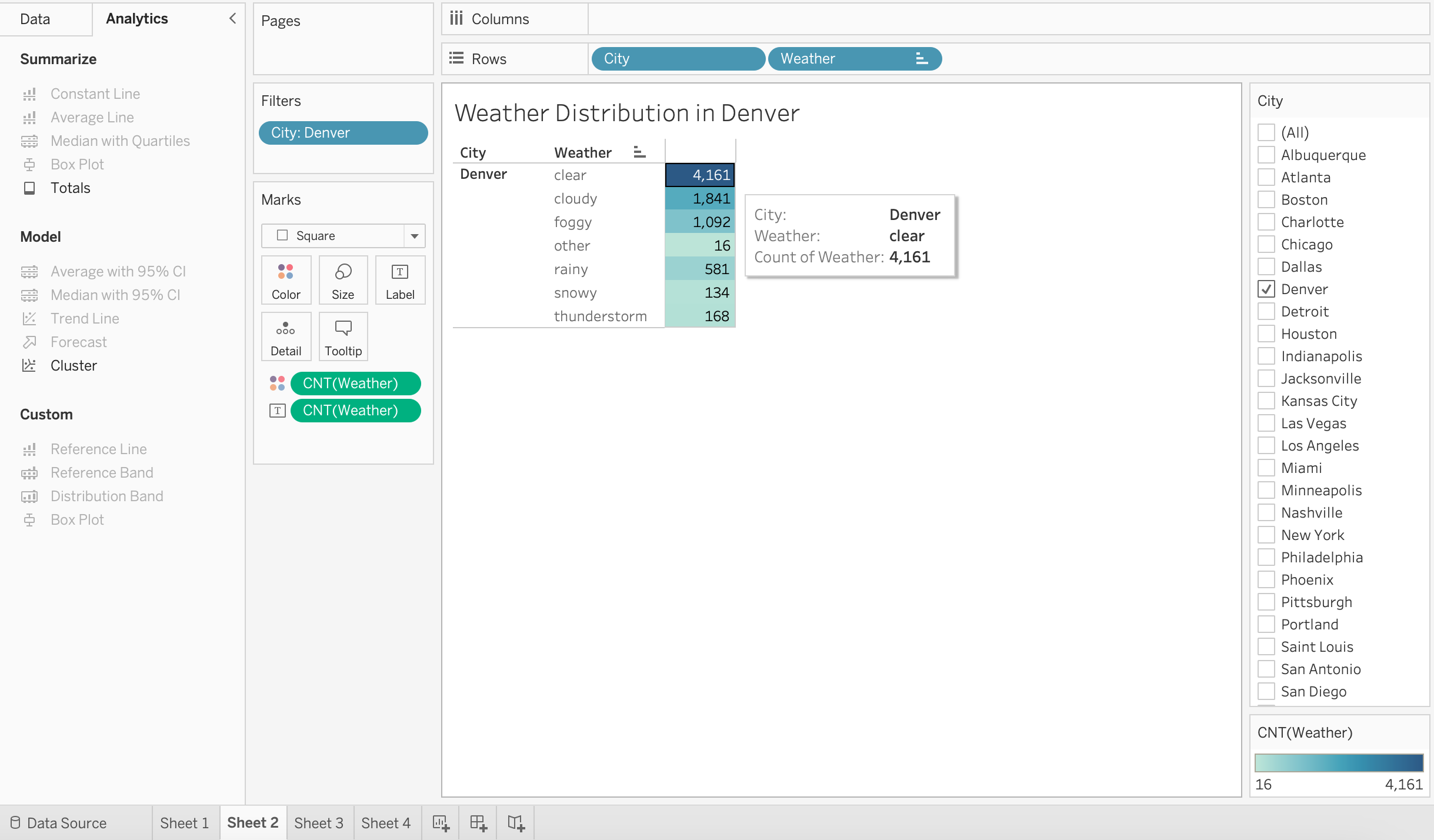
The above highlight table in Tableau depicts the weather distribution in Denver in 2017. The weather of Denver is clear for most of the time.
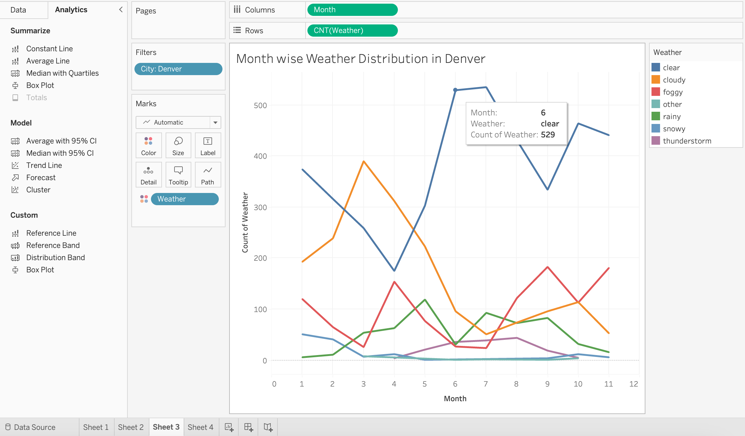
The above line plot in Tableau depicts the Month Wise Weather distribution in Denver in 2017.
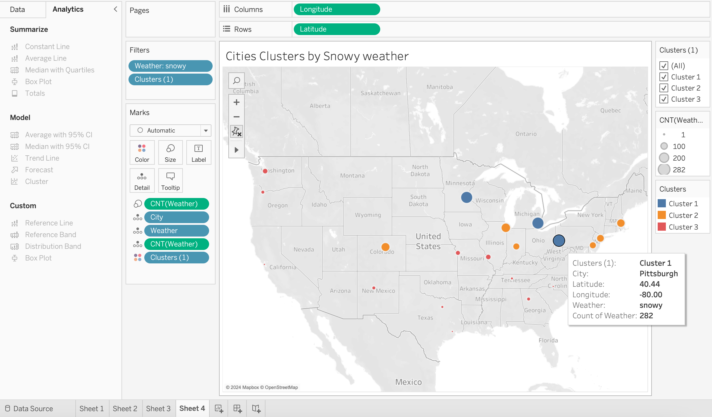
The above Map in Tableau depicts clusters of the cities based on frequency of Snowy Weather. Cities in Blue cluster experienced Snowy Weather most times followed by Cities in Orange and Red Clusters.